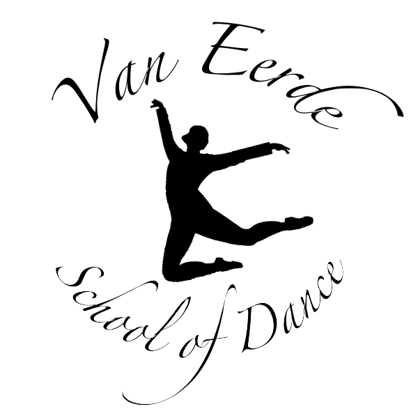
She gave me some vague ideas and told me to run with them, and I designed a simple logo for her as a starting point (the figure in it is actually her, a silhouette I created from a photo of hers).
She asked for a few redesigns and tweaks, we tried some additional designs, and we eventually came up with a refined design of my original logo.
I also designed a white-on-black version, as well as several other colours she wanted to try; she decided a silhouette logo, similar to the Wind it Up logo I created, as it was more flexible in terms of colours
A selection of colours tried out:
Alongside the man logo, Christa also requested a long version of the logo which could be used for letter headings, email signatures, but still obviously be a logo for the same dance school. These are the black-on-white and white-on-black designs I made for her:
I enjoyed working to create a more elegant design than previous logos I have made.


No comments:
Post a Comment