Sunday 2 February 2014

Christa Van Eerde School of Dance

One of the people I worked with for the Dance Society show marketing in a previous post, Christa, got in touch with me after university to ask me if I could design a logo for a dance school she wanted to set up (and is still in the progress of doing so).

She gave me some vague ideas and told me to run with them, and I designed a simple logo for her as a starting point (the figure in it is actually her, a silhouette I created from a photo of hers). 

She asked for a few redesigns and tweaks, we tried some additional designs, and we eventually came up with a refined design of my original logo.


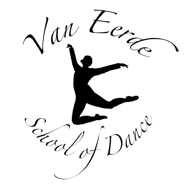
I also designed a white-on-black version, as well as several other colours she wanted to try; she decided a silhouette logo, similar to the Wind it Up logo I created, as it was more flexible in terms of colours


A selection of colours tried out:


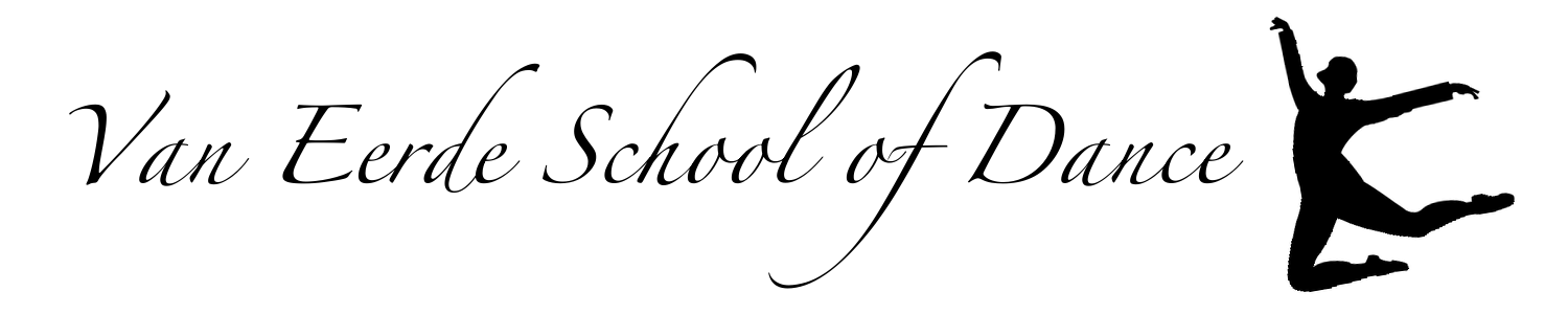
Alongside the man logo, Christa also requested a long version of the logo which could be used for letter headings, email signatures, but still obviously be a logo for the same dance school. These are the black-on-white and white-on-black designs I made for her:


I enjoyed working to create a more elegant design than previous logos I have made.

Saturday 1 February 2014

Wind it Up - University of St Andrews' Dance Society Show 2010


 2009-2010, I was the publicity officer of the University of St Andrews' Dance Society. As such, it was my job to do all the publicity for the end-of-year show. I worked closely with the show convenors & other members (such as my friend Christa, who took the lovely photos we used) to create this set of posters which went around town. This was the first year that we had a logo especially made for the show (which I created & designed using figures of our dancers from the photo shoot) - it was my suggestion & has since become a regular thing for the society. 

The show was called "Wind it Up", with the theme centring around time, clockwork, etc., so I put wind-up keys in the back of the dancers' silhouettes, as if they were clockwork toys. 

2 weeks before these posters, we also put up "teaser" posters: plain black with white writing in the same font as the main logo, with the logo below. They had short 'sayings' on them, such as "tick tock", to hint at the show theme, but not explicitly say what the posters were about. 

We then put up the main posters: on the same day, we asked every society member to wear their red show hoodies (red to match the logo). This was a regular part of our yearly show marketing, but this time we we could use our actual show logo on the hoodies, rather than just the show title in a pretty font; members reported getting lots of positive comments on the hoodies from friends & having people ask them what it was about. This was the design used on the back of the hoodie, printed in white:


On the same day, lots of us got up early to draw chalk outlines of the dancer silhouettes on the pavement, with "Wind it Up!" and the show dates next to them. Committee members also did a "flash mob" style dance in the street in show hoodies; we also recorded it, which I edited together & put up on YouTube.


Members also wore the hoodies when selling tickets outside the student union.

All of this marketing put together meant that the show sold out two out of three nights for the first time ever, with only a handful of seats leftover on the first night (the first night usually sold less than the last two, and the previous year less than half of the tickets had been sold for that night).

I was really proud to have worked on such a successful campaign and with such great people who all worked so hard together to make it all happen.